

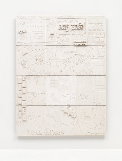
The work looks like a wall covered in signs, drawings, words and little bits of information. There is so much on the surface, yet everything is white, so some details are easy to miss. The words, symbols and images seem to come from different places. Looking at it, I get the feeling of walking past a wall filled with messages and trying to read as much as I can before moving on. It doesn’t give you one thing to focus on, and I think that is part of what makes it interesting.
The white colour is a strange choice for a work with so many details. It makes everything blend together, and some of the writing almost disappears into the background. I had to look closely to notice certain things. If the artist used different colours, the work might have been easier to read, but it would probably lose some of what makes it look this way. The white makes the surface feel quiet, even though there is a lot going on.
Some of the words seem to refer to people, places, businesses and everyday things. I can’t read all of them clearly, but they make the work feel personal. It reminds me of things you see around a neighbourhood, signs on buildings, names on shops, messages on walls and things people leave behind. They might not mean much to someone passing by, but they can hold memories for the people who know what they are referring to.
The way everything is placed also makes me think about how people collect things without even realising it. A name, a sign, a drawing, a memory of somewhere you have been. They all end up staying with you in one way or another. Halsey brings these things together on one surface, and it feels like there is a story behind some of them, even though we are not told what that story is. I wish I could read more of the writing because it makes me curious about what she chose to include and why.
I don’t think this is the kind of work you can just glance at and move on from. There are too many small details, and some of them are easy to overlook. The surface almost feels like it was made for someone to stand in front of it for a while, looking at one section before moving to another. It is not loud or colourful, but it still manages to hold your attention. I also like that it doesn’t feel perfectly neat, even though the whole work is white. The different images and text give it a lot of character.
exodus recovery makes me think about memory, where people come from and the things that remain important to them. I may not understand every word or symbol in the work, but I can still appreciate how it brings so many different things together. It feels like a collection of stories that have been placed side by side, with some being more visible than others. The title also makes me wonder what recovery means here and what is being held onto or brought back. I like that the work leaves me with those questions instead of explaining everything.


Comments are closed.